Boxplots
Overview
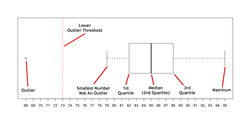
A boxplot is a way to graphically represent quantitative data. The boxplot is based on the Five Number Summary: minimum, 1st quartile, median, third quartile, and maximum. In addition, if outliers are present, boxplots will typically show them.
As the example below shows: the smallest non-outlier value and the largest non-outlier value are solid vertical lines connectd to the box by dotted horizontal lines; the 1st and 3rd quartiles make up the edges of the box; the median is a vertical line somewhere inside the box; and the outliers are represented as dots.
Constructing a Boxplot (Example 2)
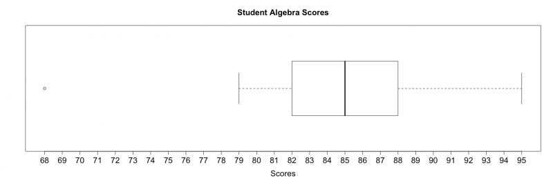
Construct a modified boxplot using the following dataset of student algebra scores:
95, 79, 68, 93, 86, 87, 83, 84, 85, 88, 82, 90, 80, 86, 84
Use the following steps to construct a boxplot:
STEP 1: Sort the data from least to greatest as shown below:
68, 79, 80, 82, 83, 84, 84, 85, 86, 86, 87, 88, 90, 93, 95
STEP 2: Determine the quartiles:
1st Quartile: 82 Median (2nd Quartile): 85 3rd Quartile: 88
STEP 3: Determine the Interquartile Range:
IQR = 3rd Quartile – 1st Quartile = 88 – 82 = 6
IQR = 6
STEP 4: Determine Upper Outlier Threshold & Lower Outlier Thresholds:
|
Lower Outlier Threshold = Q1 – 1.5(IQR) Lower Outlier Threshold = 82 – 1.5(6) Lower Outlier Threshold = 82 – 9 = 73 Lower Outlier Threshold = 73 |
Upper Outlier Threshold = Q3 + 1.5(IQR) Upper Outlier Threshold = 88 + 1.5(6) Upper Outlier Threshold = 88 + 9 = 97 Upper Outlier Threshold = 97 |
STEP 5: Using the calculated information from above, construct a boxplot as shown below.
NOTE: The red dashed line represents the lower outlier threshold and for demonstration purposes only. Any points that fall below the lower outlier threshold should be considered an outlier. In this particular example, 68 is considered an outlier.
STEP 6: Make sure to always label your graphics. For the boxplot below, the main title and x-axis label were added.