Describing Data - Categorical vs Numerical
Categorical
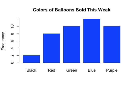
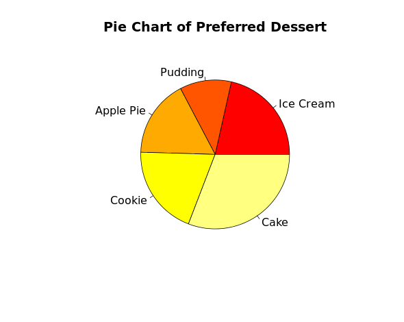
Categorical data represent characterisitcs that one can observe and sort into groups. If this data happens to be numerical, then the numbers would not have any mathematical meaning or proper order. Examples of cateogrical data are class (freshman, sophomore, etc), color (blue, red, yellow, etc), and gender (male, female). To graph categorical data, one uses bar charts and pie charts.
Bar chart: Bar charts use rectangular bars to plot qualitative data against its quantity.
Pie chart: Pie charts are circular graphs in which various slices have different arc lengths depending on its quantity.
Numerical
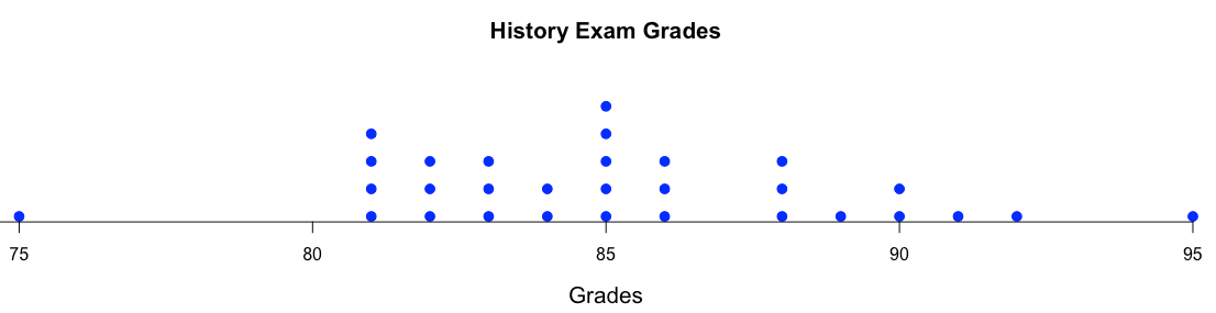
Numerical data represent values that can be measured and put into a logical order. Examples of numerical data are height, weight, age, number of movies watched, IQ, etc. To graph numerical data, one uses dot plots, stem and leaf graphs, histograms, box plots, ogive graphs, and scatter plots.
Dot plot:
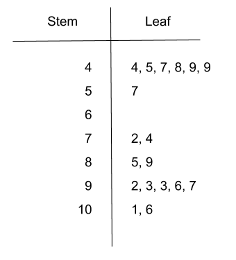
Stem and leaf: For these graphs, the stem represents the first digit of the number and the leaf/leaves represent the second digit(s). For example, when 4 is the stem and 5 is the leaf, the corresponding number is 45.
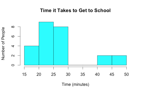
Histogram: Histograms, similar to bar graphs, use rectangular bars whose heights correspond to frequency. However, bar graphs plot categorical data and have gap between each bar, whereas histograms plot numerical data and are continuous (no gaps).
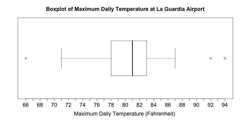
Box plot: Box plots graphically represent the Five Number Summary. For more information on box plots, click here.
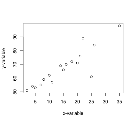
Scatter plot: These graphs have an x-variable and a y-variable. The data points are plotted to see if there is an association between the two variables.
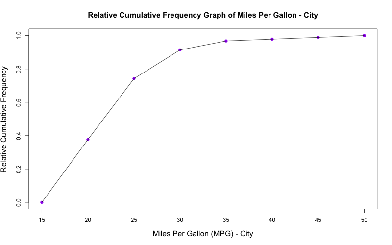
Ogive: Ogive graphs plot a variable against its corresponding percentile (the percent of observations at or below that value). For more information on ogives, click here.