Dotplot Graphs
Introduction
A dotplot is a graph used to represent quantitative data. It consists of data points plotted above the x-axis, typically using dots. For relatively small amounts of data, dotplots are fairly easy to create and interpret.
Example
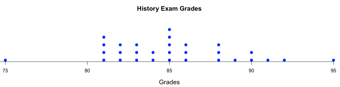
A high school history teacher recorded the test scores for 30 students on a recent exam. The score are listed below:
88, 90, 85, 83, 89, 85, 81, 85, 86, 88, 85, 90, 85, 81, 86, 82, 84, 82, 83, 95, 88, 91, 92, 86, 82, 81, 81, 75, 83, 84
Using the data above, construct a dotplot to better visualize and understand the data.
Solution:
1. Begin by sorting the data as shown below:
75, 81, 81, 81, 81, 82, 82, 82, 83, 83, 83, 84, 84, 85, 85, 85, 85, 85, 86, 86, 86, 88, 88, 88, 89, 90, 90, 91, 92, 95
2. Determine the maximum and mimumum values:
minimum: 75 maximum:95
3. Determine an easy to interpret range for your tick marks. For this example, creating an x-axis from 75 to 95, with tick marks spaced 5 units apart seems appropriate.
4. Place dots above the x-axis at the appropriate x locations. Also, make sure to stack the points when there are multiple values at any given location.
5. Make sure to label the main title and x-axis.