Assessing Normality: Normal Probability Plots
Introduction
Statisticians often need tools to assess the normality of data. In other words, they need a way to answer the question: is the data normal or not?
One of the most basic ways to check is by seeing if the Empirical Rule applies. Where x̅ represents the sample mean and s represents the standard deviation, if and only if the data is normal, then:
68% of the data should be between x̅ +/- s
95% of the data should be between x̅ +/- 2s
99.7% of the data should be between x̅ +/- 3s
Another method of assessing normality is creating a normal probability plot.
The Shapes of Normal Probability Plots
|
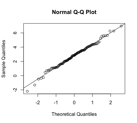
Symmetrical / Normal (No Skew) |
 |
| Skewed Right | 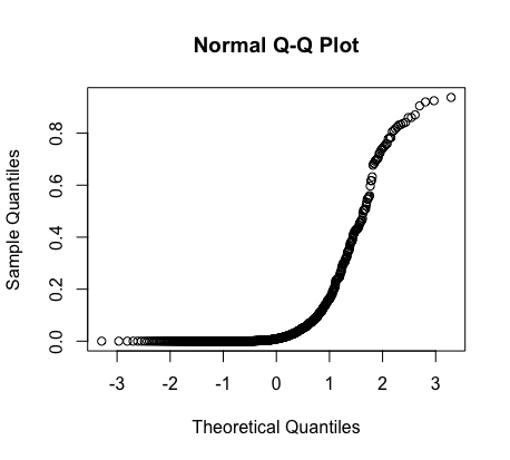 |
| Skewed Left | 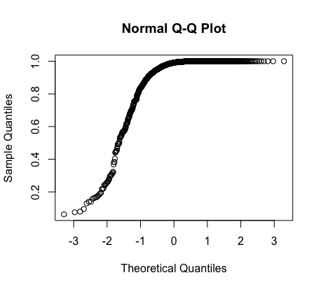 |
How to Create a Normal Probability Plot (TI-84)
Using a TI-84 calculator, follow these steps to create a normal probability plot:
1. Enter data into calculator by hitting 'STAT' and then 'Edit'
2. Hit '2nd' and then 'Y=' to access Stat Plot.
3. Enter Plot 1.
4. Turn Plot 1 'On' and then toggle below to 'Type.' Then click right until you get to the bottom right graph.
5. Hit 'ZOOM' and then scroll down to '9: Zoom Stat'