R: Categorical Scatterplots & Legends
An electric car manufacturer asked engineers to do nine seperate endurance tests on two of their car models. One model is called the Electra and the second is called the Voyage. The test requires the cars to travel at their top speeds until the cars run out of energy and stop. The data below represents the time and distance traveled for each of the trials until each car stopped.
| Electra | Time (min) | 225 | 202 | 205 | 221 | 215 | 238 | 216 | 230 | 237 |
| Distance (miles) | 324 | 282 | 284 | 318 | 297 | 332 | 287 | 309 | 323 | |
| Voyage |
Time (min) |
237 | 251 | 244 | 251 | 229 | 252 | 223 | 258 | 246 |
| Distance (miles) | 390 | 390 | 383 | 393 | 381 | 402 | 346 | 413 | 397 |
1. Begin by entering the data into R using the following code.
# For Electra, enter time (e.t) and distance (e.d)
e.t=c(225, 202, 205, 221, 215, 238, 216, 230, 237)
e.d=c(324, 282, 284, 318, 297, 332, 287, 309, 323)

# For Voyage, enter time (v.t) and distance (v.d)
v.t=c(237, 251, 244, 251, 229, 252, 223, 258, 246)
v.d=c(390, 390, 383, 393, 381, 402, 346, 413, 397)
2. Next, to eventually fit all of the data onto our scatterplot, we need to determine the x-axis limits and the y-axis limits.
> x.data = c(e.t, v.t)
> range(x.data)
[1] 202 258
>
> # Combine all of the y-axis data into one dataset
> y.data = c(v.t, v.d)
> range(y.data)
[1] 223 413
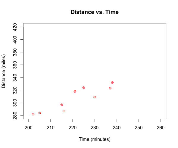
3. Now that we know the range required of the x-axis and y-axis, we can define those during the construction of the plot. We will begin by just plotting the Electra car data, and defining all of our plot parameters.
# Construct plot, define plot parameters, and plot Electra data
plot(e.t, e.d,
     xlim = c(200, 260),
     ylim = c(280, 420),
     xlab = "Time (minutes)",
     ylab = "Distance (miles)",
     main = "Distance vs. Time",
     pch = 10,
     col = "red")
Once the R code above is run, the following graph is produced.
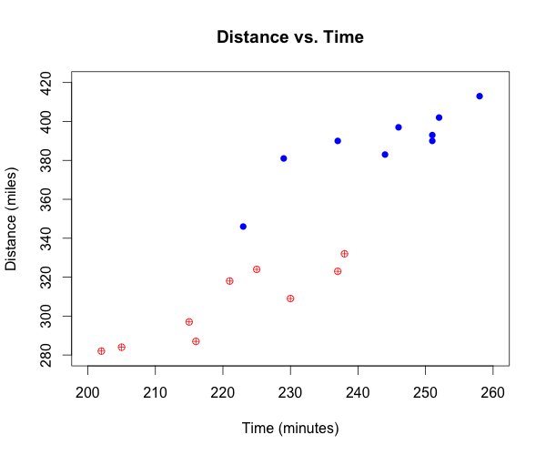
4. Next, we want to add the Voyage car data to the scatterplot. It's important to note that because we previously calculated, and then defined the x-axis and y-axis limits to accomadate the Voyage car data, we can be confident that all of the Voyage data will be displayed once the points are added to the graph.
# Add points from Voyage car data
points(v.t, v.d,
       pch = 16,
       col = "blue")
Once the R code above is run, the first graph will be updated to include the Voyage data as shown below.
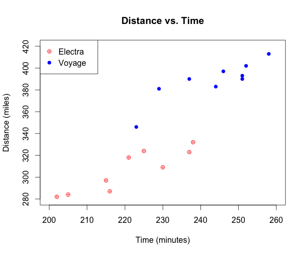
# Add legend to the plot
legend("topleft",
       pch = c(10,16),
       col = c("red","blue"),
       c("Electra","Voyage"))
Once the R code above is run, the graph will be updated to include the legend.

This work is licensed under a Creative Commons Attribution-NonCommercial-ShareAlike 4.0 International License.