R - Histograms
Histograms are graphs that represent the distribution of data using bars. Each bar (called a “bin”) represents one interval of data. Smaller intervals means more bins are used in the graph, while larger intervals means less bins are used. The height of each bar corresponds to how frequently data that falls in that bin (within that interval) appears.
Constructing Histograms in R
For a set of data x, the basic command to create a histogram is:
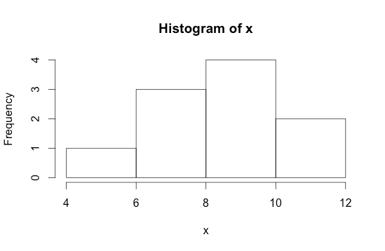
hist(x)
|
R Code
|
Output |
Bins
To define the number of bins in your histogram:
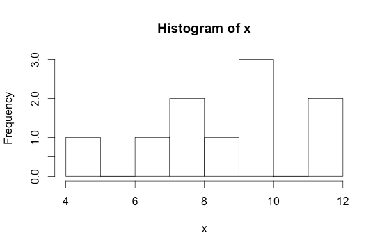
hist(x, breaks=numberofbins)
|
R Code
|
Output |
Adding a Density Curve
To change the y-axis from frequency to probability:
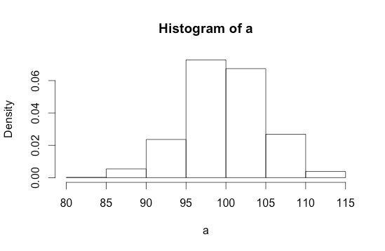
hist(x, prob=T)
|
R Code
|
Output |
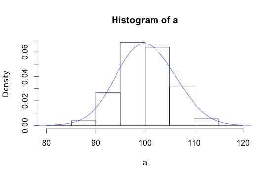
To add density curve, add the command:
lines(density(x, bw=number)
|
R Code
|
Output |
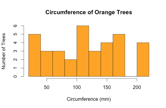
Example 1:
|
RStudio Code
|
Output |
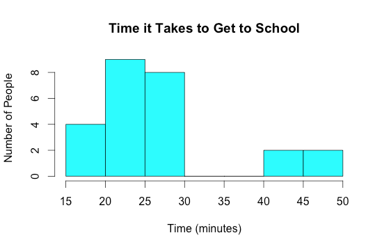
Example 2:
|
RStudio Code
|
Output |
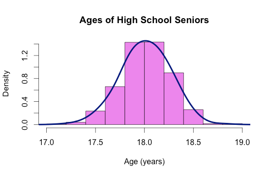
Example 3:
|
RStudio Code
|
Output |

This work is licensed under a Creative Commons Attribution-NonCommercial-ShareAlike 4.0 International License.